第15章 画面とコンポーネントを実装する
Expo Routerでタブとモーダルの土台を敷き、一覧・編集・設定の3画面を実際に組み上げます。
データ層が用意できたので、ここからは見える部分を組み立てます。Expo Routerでルーティングの土台を敷き、TODO一覧・編集モーダル・設定の3画面と、再利用するコンポーネントを順に作っていきます。
ルーティングの全体像をもう一度
第13章で示した構造をコードに落とすと、app/配下は次のようになります。
src/app/
├── _layout.tsx          # Root Stack
├── (tabs)/
│   ├── _layout.tsx      # Native Tabs
│   ├── (home)/
│   │   ├── _layout.tsx  # 一覧用 Stack
│   │   └── index.tsx    # TODO一覧
│   └── settings/
│       ├── _layout.tsx  # 設定用 Stack
│       └── index.tsx    # 設定画面
└── edit.tsx # 追加・編集モーダル(tabs)や(home)のように()で囲まれたディレクトリはグループルートで、URLパスには現れません。グルーピングだけが目的の入れ子です。
ルートレイアウト
最上段のStackには2つの仕事があります。タブ全体を(tabs)として持つことと、編集画面をpresentation: "modal"としてその上に重ねることです。
// src/app/_layout.tsx
import {
  DarkTheme as NavigationDarkTheme,
  DefaultTheme as NavigationLightTheme,
  ThemeProvider,
} from "@react-navigation/native";
import { Stack } from "expo-router";
import { StatusBar } from "expo-status-bar";
import { GestureHandlerRootView } from "react-native-gesture-handler";

import { useTheme } from "@/hooks/use-theme";

export default function RootLayout() {
  const { scheme, colors } = useTheme();

  const navigationTheme =
    scheme === "dark"
      ? { /* ... NavigationDarkTheme をベースに自分のパレットを混ぜる ... */ }
      : { /* ... NavigationLightTheme 側 ... */ };

  return (
    <GestureHandlerRootView style={{ flex: 1 }}>
      <ThemeProvider value={navigationTheme}>
        <StatusBar style={scheme === "dark" ? "light" : "dark"} />
        <Stack
          screenOptions={{
            headerStyle: { backgroundColor: colors.surface },
            headerTitleStyle: { color: colors.text },
            headerTintColor: colors.primary,
            contentStyle: { backgroundColor: colors.background },
          }}
        >
          <Stack.Screen name="(tabs)" options={{ headerShown: false }} />
          <Stack.Screen
            name="edit"
            options={{ presentation: "modal", title: "TODO" }}
          />
          <Stack.Screen name="storybook" options={{ title: "Storybook" }} />
        </Stack>
      </ThemeProvider>
    </GestureHandlerRootView>
  );
}ThemeProviderに渡しているのは@react-navigation/nativeのテーマです。Expo Routerは内部でReact Navigationを使っているので、ヘッダー・タブ・モーダルの配色を一貫して切り替えるには、ここに自分のパレットを混ぜ込みます。useThemeは次章で扱う自前のフックです。
(tabs)はheaderShown: falseにしてあります。タブ側のStackがヘッダーを描くので、ルートStackのヘッダーは要りません。
editにpresentation: "modal"を付けると、iOSでは下からせり上がる標準のモーダル、Androidでも近い見た目になります。タブの上に重なる遷移なので、ルートStackの直下に置く必要があります。タブの中に書くとタブバーごとモーダルに包まれてしまいます。
最上段のGestureHandlerRootViewは、後ほどTodoItemに追加するスワイプ操作で必要になるものです。React NativeのPressableやScrollViewの中だけで完結するジェスチャと違って、react-native-gesture-handlerが提供するジェスチャは「アプリ全体のジェスチャツリー」を持つ必要があるので、ここで一度だけ親として被せます。
ネイティブタブ
タブはExpo Routerのunstable-native-tabsを使います。SDK 55から提供されている、iOSのUITabBar/AndroidのMaterial Bottom Navigationを直接使うAPIです。
// src/app/(tabs)/_layout.tsx
import { NativeTabs } from "expo-router/unstable-native-tabs";

export default function TabsLayout() {
  return (
    <NativeTabs>
      <NativeTabs.Trigger name="(home)">
        <NativeTabs.Trigger.Icon sf="checklist" drawable="ic_menu_agenda" />
        <NativeTabs.Trigger.Label>TODO</NativeTabs.Trigger.Label>
      </NativeTabs.Trigger>
      <NativeTabs.Trigger name="settings">
        <NativeTabs.Trigger.Icon sf="gearshape" drawable="ic_menu_preferences" />
        <NativeTabs.Trigger.Label>設定</NativeTabs.Trigger.Label>
      </NativeTabs.Trigger>
    </NativeTabs>
  );
}
アイコンはiOSがSF Symbols、Androidがandroid.R.drawableの名前で指定します。両方を1つのpropsで書ける点と、ネイティブの見た目がそのまま出る点がunstable-native-tabsの良いところです。unstable-が取れていない通り将来の変更余地はありますが、SDK 55時点では十分実用に耐えます。
クロスプラットフォームで完全に同じ見た目を作りたい場合は、従来の@react-navigation/bottom-tabsを使うと細かく制御できます。本書ではネイティブの仕上がりを優先します。
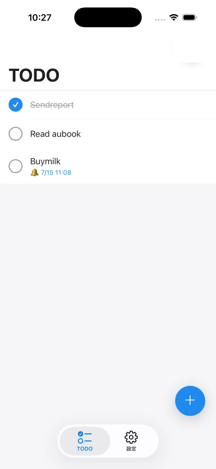
unstable-native-tabsで描画したタブバー(画面下部)です。iOSのUITabBarがそのまま使われています。
TODO一覧画面
各タブの中にもStackを置いて、画面ごとのヘッダーを持たせます。一覧側は大型タイトル(headerLargeTitle)を有効にしておきます。iOSではスクロールに合わせて折りたたまれる、おなじみの大型タイトルです。
// src/app/(tabs)/(home)/_layout.tsx
import { Stack } from "expo-router";

import { useTheme } from "@/hooks/use-theme";

export default function HomeStackLayout() {
  const { colors } = useTheme();

  return (
    <Stack
      screenOptions={{
        headerStyle: { backgroundColor: colors.surface },
        headerTitleStyle: { color: colors.text, fontWeight: "700" },
        headerTintColor: colors.primary,
        headerLargeTitle: true,
        headerLargeTitleStyle: { color: colors.text },
        contentStyle: { backgroundColor: colors.background },
      }}
    >
      <Stack.Screen name="index" options={{ title: "TODO" }} />
    </Stack>
  );
}
肝心の一覧本体です。
// src/app/(tabs)/(home)/index.tsx
import { useRouter } from "expo-router";
import { useMemo, useState } from "react";
import { FlatList, StyleSheet, View } from "react-native";
import { useSafeAreaInsets } from "react-native-safe-area-context";

import { EmptyState } from "@/components/empty-state";
import { Fab } from "@/components/fab";
import { FilterBar, type TodoFilter } from "@/components/filter-bar";
import { TodoItem } from "@/components/todo-item";
import { useTheme } from "@/hooks/use-theme";
import { useTodosStore } from "@/stores/todos";
import type { ThemeColors } from "@/theme/colors";

export default function TodoListScreen() {
  const router = useRouter();
  const { colors } = useTheme();
  const insets = useSafeAreaInsets();
  const styles = createStyles(colors);

  const todos = useTodosStore((state) => state.todos);
  const toggleTodo = useTodosStore((state) => state.toggleTodo);
  const removeTodo = useTodosStore((state) => state.removeTodo);

  const [filter, setFilter] = useState<TodoFilter>("all");

  const counts = useMemo(
    () => ({
      all: todos.length,
      active: todos.filter((todo) => !todo.completed).length,
      completed: todos.filter((todo) => todo.completed).length,
    }),
    [todos],
  );

  const filteredTodos = useMemo(() => {
    const sorted = [...todos].sort((a, b) => b.createdAt - a.createdAt);
    if (filter === "active") return sorted.filter((todo) => !todo.completed);
    if (filter === "completed") return sorted.filter((todo) => todo.completed);
    return sorted;
  }, [todos, filter]);

  const isEmpty = filteredTodos.length === 0;

  return (
    <View style={styles.container}>
      {todos.length > 0 && (
        <FilterBar value={filter} onChange={setFilter} counts={counts} />
      )}
      {isEmpty ? (
        <EmptyState
          title={
            todos.length === 0
              ? "まだ TODO がありません"
              : "条件に合う TODO はありません"
          }
        />
      ) : (
        <FlatList
          data={filteredTodos}
          keyExtractor={(item) => item.id}
          contentInsetAdjustmentBehavior="automatic"
          contentContainerStyle={{ paddingBottom: insets.bottom + 96 }}
          renderItem={({ item }) => (
            <TodoItem
              todo={item}
              onPress={() => router.push({ pathname: "/edit", params: { id: item.id } })}
              onToggle={() => toggleTodo(item.id)}
              onDelete={() => removeTodo(item.id)}
            />
          )}
          ItemSeparatorComponent={() => <View style={styles.separator} />}
        />
      )}
      <Fab onPress={() => router.push("/edit")} bottom={insets.bottom + 16} />
    </View>
  );
}

const createStyles = (colors: ThemeColors) =>
  StyleSheet.create({
    container: { flex: 1, backgroundColor: colors.background },
    separator: {
      height: StyleSheet.hairlineWidth,
      backgroundColor: colors.divider,
      marginLeft: 56,
    },
  });
短く見えるかもしれませんが、ここに今までの章の要素が集まっています。
useTodosStoreからはセレクタでtodosとtoggleTodoだけを受け取り、そこから派生する値(フィルター後のリスト、各カテゴリの件数)はuseMemoでレンダリング中に計算しています。状態にしないことで、フィルター切り替えのたびに不要なuseEffectを走らせずに済みます(Reactの「You Might Not Need an Effect」の考え方です)。
なお、TodoItemに渡しているonDeleteは、次章(第16章)でスワイプ削除を足すときに使うpropsです。この時点のTodoItemはまだ受け取らないので、先回りで渡してあると考えてください。
FlatListのcontentInsetAdjustmentBehavior="automatic"はiOSで大型タイトル下のセーフエリアを自動調整してくれる属性です。contentContainerStyleのpaddingBottomにinsets.bottom + 96を足しているのは、リストの末尾がFAB(画面右下のボタン)に隠れないようにするためです。
Fabの位置は絶対配置にしておきます。タブバーやホームインジケーターを避けるためにuseSafeAreaInsetsの値を使って下端をずらしています。
編集モーダル
追加と編集を1つの画面に兼ねます。URLパラメータにidがあれば編集、なければ新規追加です。
// src/app/edit.tsx (要点のみ)
import { Stack, useLocalSearchParams, useRouter } from "expo-router";
import { useState } from "react";
import {
  Alert,
  KeyboardAvoidingView,
  Platform,
  Pressable,
  Text,
  TextInput,
  View,
} from "react-native";

import { useTodosStore } from "@/stores/todos";

export default function EditScreen() {
  const router = useRouter();
  const { id } = useLocalSearchParams<{ id?: string }>();
  const isEditing = typeof id === "string" && id.length > 0;

  const existingTodo = useTodosStore((state) =>
    isEditing ? state.todos.find((todo) => todo.id === id) : undefined,
  );
  const addTodo = useTodosStore((state) => state.addTodo);
  const updateTodo = useTodosStore((state) => state.updateTodo);
  const removeTodo = useTodosStore((state) => state.removeTodo);

  const [title, setTitle] = useState(existingTodo?.title ?? "");
  const trimmed = title.trim();
  const canSave = trimmed.length > 0;

  const handleSave = () => {
    if (!canSave) return;
    if (isEditing && existingTodo) {
      updateTodo(existingTodo.id, { title: trimmed });
    } else {
      addTodo(trimmed);
    }
    router.back();
  };

  const handleDelete = () => {
    if (!isEditing || !existingTodo) return;
    Alert.alert("削除しますか?", existingTodo.title, [
      { text: "キャンセル", style: "cancel" },
      {
        text: "削除",
        style: "destructive",
        onPress: () => {
          removeTodo(existingTodo.id);
          router.back();
        },
      },
    ]);
  };

  return (
    <KeyboardAvoidingView
      style={{ flex: 1 }}
      behavior={Platform.OS === "ios" ? "padding" : undefined}
    >
      <Stack.Screen
        options={{
          title: isEditing ? "TODO を編集" : "TODO を追加",
          headerLeft: () => (
            <Pressable onPress={() => router.back()}>
              <Text>キャンセル</Text>
            </Pressable>
          ),
          headerRight: () => (
            <Pressable onPress={handleSave} disabled={!canSave}>
              <Text>保存</Text>
            </Pressable>
          ),
        }}
      />
      <TextInput
        value={title}
        onChangeText={setTitle}
        placeholder="やることを入力"
        autoFocus
        returnKeyType="done"
        onSubmitEditing={handleSave}
        maxLength={140}
      />
      {/* 編集時はメタ情報と削除ボタンを表示(省略) */}
    </KeyboardAvoidingView>
  );
}(完全版はsrc/app/edit.tsxを参照してください。スタイル定義が長くなるので本文では省きました)
押さえどころは3つあります。
ひとつめは、Stack.Screenを画面の中で再宣言しているところです。Expo Routerでは画面コンポーネント内で<Stack.Screen options={...}>を返すと、その画面のヘッダー設定を上書きできます。「保存」「キャンセル」のように、画面の状態(canSave)によって有効/無効が変わるボタンは、ここで宣言する方が自然です。
ふたつめはKeyboardAvoidingViewです。第8章で扱ったとおり、iOSでキーボードが現れたときに入力欄が隠れないよう、画面全体を持ち上げる役目を担います。Androidは多くの場合不要なのでbehaviorをundefinedにしています。
3つめはAlert.alertの使いどころです。Webのwindow.confirmに近い感覚で、確認ダイアログを出すだけなら自前のモーダルを作るより速いです。style: "destructive"を指定するとiOSでは赤字の表示になり、ユーザーへの注意喚起がしやすくなります。
リマインダーピッカーを足す
サンプルアプリでは編集画面にリマインダー(指定時刻の通知)を設定できる欄があります。日時の入力には@react-native-community/datetimepickerを使い、保存時にstores/todos.tsのsetReminderを呼んでローカル通知を予約します。
// src/app/edit.tsx (リマインダー部分の要点)
import DateTimePicker, {
  DateTimePickerAndroid,
} from "@react-native-community/datetimepicker";

const setReminder = useTodosStore((state) => state.setReminder);

const [remindAt, setRemindAt] = useState<number | null>(
  existingTodo?.remindAt ?? null,
);
const [showIosPicker, setShowIosPicker] = useState(false);

const handleSave = async () => {
  if (!canSave) return;
  if (isEditing && existingTodo) {
    updateTodo(existingTodo.id, { title: trimmed });
    if ((existingTodo.remindAt ?? null) !== remindAt) {
      await setReminder(existingTodo.id, remindAt);
    }
  } else {
    const newId = addTodo(trimmed);
    if (remindAt) {
      await setReminder(newId, remindAt);
    }
  }
  router.back();
};

const openReminderPicker = () => {
  if (Platform.OS === "android") {
    // Android は date → time の2段ダイアログ
    DateTimePickerAndroid.open({
      value: new Date(remindAt ?? Date.now() + 60 * 60 * 1000),
      mode: "date",
      minimumDate: new Date(),
      onChange: (dateEvent, picked) => {
        if (dateEvent.type !== "set" || !picked) return;
        DateTimePickerAndroid.open({
          value: picked,
          mode: "time",
          is24Hour: true,
          onChange: (timeEvent, time) => {
            if (timeEvent.type !== "set" || !time) return;
            setRemindAt(time.getTime());
          },
        });
      },
    });
  } else {
    // iOS は inline ピッカーをトグル表示
    setShowIosPicker((prev) => !prev);
  }
};@react-native-community/datetimepickerはOS標準のピッカーをそのまま使うライブラリで、iOSとAndroidで使い方が大きく違います。
- iOS:
<DateTimePicker display="inline" />を画面内にレンダーしておけば、その場でカレンダー風のUIが出る - Android:
DateTimePickerAndroid.open(...)で命令的にダイアログを開く。日付と時刻は別ダイアログなので2段階で繋ぐ
「同じUIに見えるけど呼び方は別」というネイティブピッカー特有の癖です。プラットフォーム分岐を1箇所に閉じ込めれば、画面側のコードはそれほど複雑になりません。
保存時の流れも整理しておきます。addTodoが返す新しいIDを受け取り、リマインダーが指定されていればそのIDでsetReminderを呼ぶ ― という順序です。第14章でaddTodoをstringを返すシグネチャにしておいたのが、ここで活きます。
setReminderの中ではすでに「古い通知のキャンセル → 新しい通知の予約 → ストア更新」が行われているので、画面側はその関数を呼ぶだけで済みます。第14章の「ストアから副作用を呼ぶ」設計が、画面のコードをすっきり保つことに繋がっています。
なお、expo-notificationsの権限取得や通知ハンドラの設定はsrc/lib/notifications.tsにまとめています。scheduleTodoReminderを呼んだ時点で必要なら権限ダイアログが立ち上がる作りなので、画面側ではそれを意識する必要はありません。
// src/lib/notifications.ts (要点のみ)
import * as Notifications from "expo-notifications";
import { Platform } from "react-native";

Notifications.setNotificationHandler({
  handleNotification: async () => ({
    shouldShowBanner: true,
    shouldShowList: true,
    shouldPlaySound: true,
    shouldSetBadge: false,
  }),
});

export async function scheduleTodoReminder(
  title: string,
  date: Date,
): Promise<string | null> {
  if (date.getTime() <= Date.now()) return null;
  const granted = await ensureNotificationPermission();
  if (!granted) return null;
  await ensureAndroidChannel();

  return Notifications.scheduleNotificationAsync({
    content: { title: "TODO のリマインダー", body: title, sound: "default" },
    trigger: {
      type: Notifications.SchedulableTriggerInputTypes.DATE,
      date,
      channelId: "todo-reminder",
    },
  });
}Androidは通知チャンネルを1つ作っておかないと通知が出ません。「重要度」「サウンド」「振動」などをチャンネル単位でユーザーが管理できる仕組みで、Android 8以降では必須の概念です。最初の通知予約のタイミングで一度だけsetNotificationChannelAsyncを呼ぶ作りにしておけば、初期化漏れの心配はなくなります。
app.jsonのpluginsにもexpo-notificationsと@react-native-community/datetimepickerを追加しておきます。
{
  "expo": {
    "plugins": [
      "@react-native-community/datetimepicker",
      [
        "expo-notifications",
        { "color": "#208AEF" }
      ]
    ]
  }
}両プラグインともネイティブ側の設定変更を伴うので、変更後はexpo prebuildでネイティブプロジェクトに反映してDevelopment Buildを焼き直す必要があります。Expo Goでも基本動作の確認はできますが、本番に近い挙動はビルドし直してから確認するのが安全です。
設定画面
3画面目の設定は、テーマ切り替えと開発者向け項目だけです。リスト風のレイアウトはネイティブアプリで頻出するので、テンプレートとして見ておくと使い回しが効きます。
// src/app/(tabs)/settings/index.tsx (要点のみ)
import { useRouter } from "expo-router";
import { Pressable, ScrollView, Text, View } from "react-native";

import { useTheme } from "@/hooks/use-theme";
import { usePreferencesStore, type ThemePreference } from "@/stores/preferences";

const THEME_OPTIONS: { value: ThemePreference; label: string; description: string }[] = [
  { value: "system", label: "システムに合わせる", description: "OSの設定に追従します" },
  { value: "light", label: "ライト", description: "常に明るいテーマで表示" },
  { value: "dark", label: "ダーク", description: "常に暗いテーマで表示" },
];

export default function SettingsScreen() {
  const router = useRouter();
  const themePreference = usePreferencesStore((s) => s.themePreference);
  const setThemePreference = usePreferencesStore((s) => s.setThemePreference);

  return (
    <ScrollView contentInsetAdjustmentBehavior="automatic">
      {/* テーマ選択 */}
      {THEME_OPTIONS.map((option) => (
        <Pressable
          key={option.value}
          onPress={() => setThemePreference(option.value)}
        >
          <Text>{option.label}</Text>
          <Text>{option.description}</Text>
          {themePreference === option.value && <Text>✓</Text>}
        </Pressable>
      ))}

      {/* 開発時のみ表示 */}
      {__DEV__ && (
        <Pressable onPress={() => router.push("/storybook")}>
          <Text>Storybook を開く</Text>
        </Pressable>
      )}
    </ScrollView>
  );
}__DEV__はReact Nativeのグローバル変数で、開発ビルドの時だけtrueになります。Storybookへの導線のような開発者専用の項目を本番ユーザーに見せたくないとき、これで囲んでおけば、リリースビルドのバンドルからは関連コードがTree-shakingで除去されます。
ここまでで「3つの画面のルーティングと骨格」が一通り揃いました。一区切り入れる地点なので、長く感じた人はここで一度ブラウザを閉じても構いません。
次章では、画面の中で繰り返し使う部品(TodoItem、FilterBar、Fab、EmptyState)と、スワイプ操作・触覚フィードバックといったモバイルらしいインタラクションを実装していきます。